README
Open on GitHub ↗🚀 TinaDocs - Your Complete Documentation Solution
Modern documentation made simple and powerful
TinaDocs is a complete documentation solution built with Tina CMS that combines developer-friendly tools with content creator accessibility.
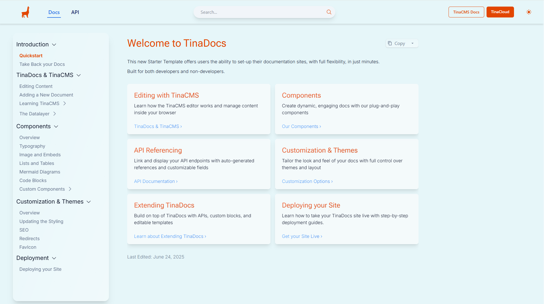
Figure: Landing Page of TinaDocs
✨ Why Choose TinaDocs
Rich Feature Set
- 🔍 Fast search - Powered by Pagefind for instant content discovery
- 📊 API documentation - Generate beautiful API docs from your OpenAPI specs
- 📑 Multi-tab interfaces - Organize complex information with tabbed layouts
- 🎨 Custom theming - Make your docs match your brand
- ✏️ Visual editing - Content creators can edit directly through TinaCMS
- 📱 Responsive design - Works great on all devices
- ⚡ Performance optimized - Built with Next.js for fast load times
What Makes It Special
- Modern stack - Clean, maintainable codebase
- Developer-friendly - Easy to customize and extend
- Content creator-friendly - Non-technical team members can contribute
- SEO optimized - Built-in best practices for search visibility
🚀 Quick Start with npx
The fastest way to get started with TinaDocs is using npx:
npx create-tina-app@latest my-docs --template tina-docs
This command will:
- Download and set up TinaDocs in a new directory called
my-docs - Prompt you to select your preferred theme during setup
- Configure the basic project structure
- Install all necessary dependencies
Available Themes
When using npx, you can choose from these beautiful themes:
- Default - Clean black and white design
- Tina - TinaCMS-inspired theme with orange accents
- Blossom - Elegant pink/rose color scheme
- Lake - Professional blue color palette
- Pine - Natural green tones
- Indigo - Modern purple/indigo design
📖 How to Use TinaDocs
There are two ways you can use TinaDocs:
• For developers – as a launching point to develops a highly custom docs solution. TinaCMS is based on markdown. Use this code as a basis to implement custom components to be used in MDX to fit your use case. Follow the Getting Started guide below.
• Quickest experience – use as is and deploy in minutes via TinaCloud for a docs setup that you still hold all the keys and data for, and get to using right away.
💡 TinaCMS integrates tighly with GitHub, and has a powerful editorial workflow based on GitHub's branch protection features.
🛠️ Getting Started
Step 1: Install Dependencies
💡 We recommend
pnpmfor faster installs. Learn why pnpm is great for Node.js projects.
pnpm install
Step 2: Start Development Server
pnpm dev
Open http://localhost:3000 to see your docs in action.
🌐 Production Setup
Step 3: Set Up GitHub and TinaCloud
- Add your docs to GitHub: Push your local repository to GitHub if you haven't already
- Create a TinaCloud account: Sign up at app.tina.io
- Link your repository: Connect your GitHub repository to TinaCloud through the dashboard
Note: if you don’t see your repo in the list, click the button “Configure your TinaCloud permissions on GitHub” at the bottom of the page - Sync Media: In your TinaCloud project, click on Media and then "Sync Media". This will import your media files (like images) from your GitHub repository into Tina’s Media Manager so they’re available in the visual editor.
Step 4: Configure Environment
- Rename
.env.exampleto.env - Add your Tina credentials:
NEXT_PUBLIC_TINA_CLIENT_ID=<get this from app.tina.io>
TINA_TOKEN=<get this from app.tina.io>
NEXT_PUBLIC_TINA_BRANCH=<your content branch>
NEXT_PUBLIC_ENABLE_THEME_SELECTION=<display theme selector>
If you want to test pnpm build locally, you need to add:
NEXT_PUBLIC_SITE_URL=http://localhost:3000
Theme Preview Mode:
To enable a theme selector in the UI for previewing all themes, add:
NEXT_PUBLIC_ENABLE_THEME_SELECTION=true
💡 Note: The theme selector allows you to preview different themes in real-time, but these changes are temporary and won't persist when you open a new browser window/tab. To make a theme permanent, update the
Selected Themfield in your Settings through TinaCMS.
Step 5: Build for Production
pnpm build
🚀 Deployment
Step 6: Deploy to Vercel
TinaDocs works great with Vercel. Check out our deployment guide for detailed instructions.
🔍 Search Setup
TinaDocs includes fast search powered by Pagefind, which indexes your content during the build process.
How to Build the Search Index
To generate or update the search index, run:
pnpm build-local-pagefind
This command:
Builds the project
Generates the search index
Saves the index files to
public/pagefind/
The search index is automatically updated every time you run the build.
Custom Theming
Want to create your own custom theme? TinaDocs includes a comprehensive theming system that allows you to create custom color schemes. See the Custom Theming section below for detailed instructions on how to create and implement your own themes.
🎨 Custom Theming
TinaDocs includes a comprehensive theming system that allows you to create custom color schemes. The theme system is built on CSS custom properties (variables) and supports both light and dark modes.
How Themes Work
Themes in TinaDocs are implemented using CSS custom properties defined in src/styles/global.css. Each theme has:
- Brand colors (primary, secondary, tertiary) with hover states and gradients
- Neutral colors for backgrounds, text, and borders
- Glass effects for modern UI elements
- Dark mode variants for each theme
Theme Structure
Each theme follows this pattern in global.css:
/* LIGHT MODE */
.theme-your-theme {
  --brand-primary: #your-primary-color;
  --brand-primary-hover: #your-primary-hover;
  --brand-primary-light: #your-primary-light;
  --brand-primary-text: #your-primary-text;
  --brand-primary-contrast: #your-primary-contrast;

  --brand-primary-gradient-start: #your-gradient-start;
  --brand-primary-gradient-end: #your-gradient-end;

  /* ... more brand colors ... */

  --neutral-background: #your-background;
  --neutral-surface: #your-surface;
  --neutral-text: #your-text;
  --neutral-border: #your-border;

  --background-color: #your-page-background;
}

/* DARK MODE */
.theme-your-theme.dark {
  /* Dark mode variants of all the above colors */
}
Creating a Custom Theme
To create a new custom theme, follow these steps:
1. Add CSS Variables to src/styles/global.css
Add your theme's CSS variables after the existing themes:
/* YOUR CUSTOM THEME */
.theme-custom {
  --brand-primary: #your-primary-color;
  --brand-primary-hover: #your-primary-hover;
  --brand-primary-light: #your-primary-light;
  --brand-primary-text: #your-primary-text;
  --brand-primary-contrast: #your-primary-contrast;

  --brand-primary-gradient-start: #your-gradient-start;
  --brand-primary-gradient-end: #your-gradient-end;

  --brand-secondary: #your-secondary-color;
  --brand-secondary-hover: #your-secondary-hover;
  --brand-secondary-light: #your-secondary-light;
  --brand-secondary-text: #your-secondary-text;
  --brand-secondary-contrast: #your-secondary-contrast;

  --brand-secondary-gradient-start: #your-secondary-gradient-start;
  --brand-secondary-gradient-end: #your-secondary-gradient-end;

  --brand-tertiary: #your-tertiary-color;
  --brand-tertiary-hover: #your-tertiary-hover;
  --brand-tertiary-light: #your-tertiary-light;
  --brand-tertiary-text: #your-tertiary-text;
  --brand-tertiary-contrast: #your-tertiary-contrast;

  --brand-tertiary-gradient-start: #your-tertiary-gradient-start;
  --brand-tertiary-gradient-end: #your-tertiary-gradient-end;

  --glass-gradient-start: rgba(255, 255, 255, 0.1);
  --glass-gradient-end: rgba(255, 255, 255, 0.4);

  --neutral-background: #your-background;
  --neutral-background-secondary: #your-secondary-background;
  --neutral-surface: #your-surface;
  --neutral-text: #your-text;
  --neutral-text-secondary: #your-secondary-text;
  --neutral-border: #your-border;
  --neutral-border-subtle: #your-subtle-border;

  --background-color: #your-page-background;
}

.theme-custom.dark {
  /* Dark mode variants - invert or adjust colors for dark mode */
  --brand-primary: #your-dark-primary;
  --brand-primary-hover: #your-dark-primary-hover;
  /* ... continue with all other variables ... */

  --neutral-background: #your-dark-background;
  --neutral-surface: #your-dark-surface;
  --neutral-text: #your-dark-text;
  /* ... etc ... */
}
2. Add Theme to TinaCMS Selector
Update tina/customFields/theme-selector.tsx to include your new theme:
const themes = [
  // ... existing themes ...
  {
    value: "custom",
    label: "Custom",
    description: "Your custom theme description",
    colors: {
      primary: "#your-primary-color",
      secondary: "#your-secondary-color",
      accent: "#your-accent-color",
    },
  },
];
3. Add Theme to UI Selector
Update src/components/ui/theme-selector.tsx to include your theme in the themes array:
const themes = ["default", "tina", "blossom", "lake", "pine", "indigo", "custom"];
4. Apply Your Theme
- Temporary preview: Use the theme selector in the UI (if enabled)
- Permanent change: Update the "Selected Theme" field in TinaCMS Settings
Color Guidelines
When creating custom themes, consider these guidelines:
- Primary colors: Use for main actions, links, and important UI elements
- Secondary colors: Use for supporting elements and secondary actions
- Tertiary colors: Use for accents and highlights
- Neutral colors: Ensure good contrast ratios for accessibility
- Dark mode: Test your theme in both light and dark modes
Theme Testing
To test your custom theme:
- Enable theme preview:
NEXT_PUBLIC_ENABLE_THEME_SELECTION=true - Use the theme selector in the bottom-right corner
- Test in both light and dark modes
- Verify accessibility with sufficient contrast ratios
Theme Examples
The existing themes demonstrate different approaches:
- Default: Minimalist monochrome design
- Tina: Brand-focused with orange and blue
- Blossom: Warm, elegant pink tones
- Lake: Professional blue palette
- Pine: Natural, organic green theme
- Indigo: Modern purple/violet design
Each theme includes comprehensive color variations for different UI states and accessibility considerations.
🛠️ Utility Scripts
TinaDocs includes helpful utility scripts to manage your documentation project:
Documentation Reset
Completely reset your documentation structure to start fresh:
pnpm run cleanup
What it does:
- ✅ Removes all directories within
content/docs/(preserves onlyindex.mdx) - ✅ Removes all API schema files in
content/apiSchema/ - ✅ Removes docs-assets and landing-assets image directories
- ✅ Completely removes the API tab from navigation
- ✅ Clears Next.js cache (
.nextfolder) to prevent stale page references - ✅ Provides a clean documentation slate for new content
- ✅ Validates project structure before running
- ✅ Requires interactive confirmation - asks for explicit "yes" to proceed
🚨 CRITICAL WARNING:
This command PERMANENTLY DELETES all documentation content.
- ❌ If you've already made changes, running cleanup will DELETE your work
- ✅ Run cleanup FIRST if you want a clean slate, then make your changes
- ✅ Commit your changes to git before running cleanup if you want to preserve them
This action cannot be undone unless you have committed your changes to version control.
⚠️ Important: After running cleanup, you must restart your development server with
pnpm devto ensure Next.js rebuilds the site without cached references to deleted pages.
For detailed information about available scripts, see scripts/README.md.
📚 Learn More
- Tina Documentation - Explore Tina's full capabilities
- Getting Started Guide - Quick setup walkthrough
- GitHub Repository - Contribute or report issues
API Documentation
TinaDocs provides comprehensive API documentation capabilities powered by OpenAPI specifications. Generate beautiful, interactive API documentation directly from your OpenAPI/Swagger JSON files.
Supported Features
🔄 Dynamic Content Management
- Upload OpenAPI specs - Import your API specifications through TinaCMS
- Auto-generated navigation - Create menu structures based on API tags and endpoints
- Bulk page generation - Generate entire documentation sections from your spec
- Real-time updates - Update documentation when your API spec changes
What's Not Supported
Currently, TinaDocs does not support:
- Header configuration APIs - Custom header management endpoints
- WebSocket APIs - Real-time communication endpoints
- GraphQL schemas - GraphQL introspection schemas (use REST API docs instead)
Getting Started with API Docs
- Upload your OpenAPI spec through the API Schema collection in TinaCMS
- Create API reference pages using the API Reference component
- Generate navigation structure with the "Group of API References" template
- Customize the display by selecting specific endpoints and tags
For detailed instructions, see the API Documentation Guide and OpenAPI Spec Documentation.
Ready to improve your documentation? Give TinaDocs a try!