← BACK
inagiffy
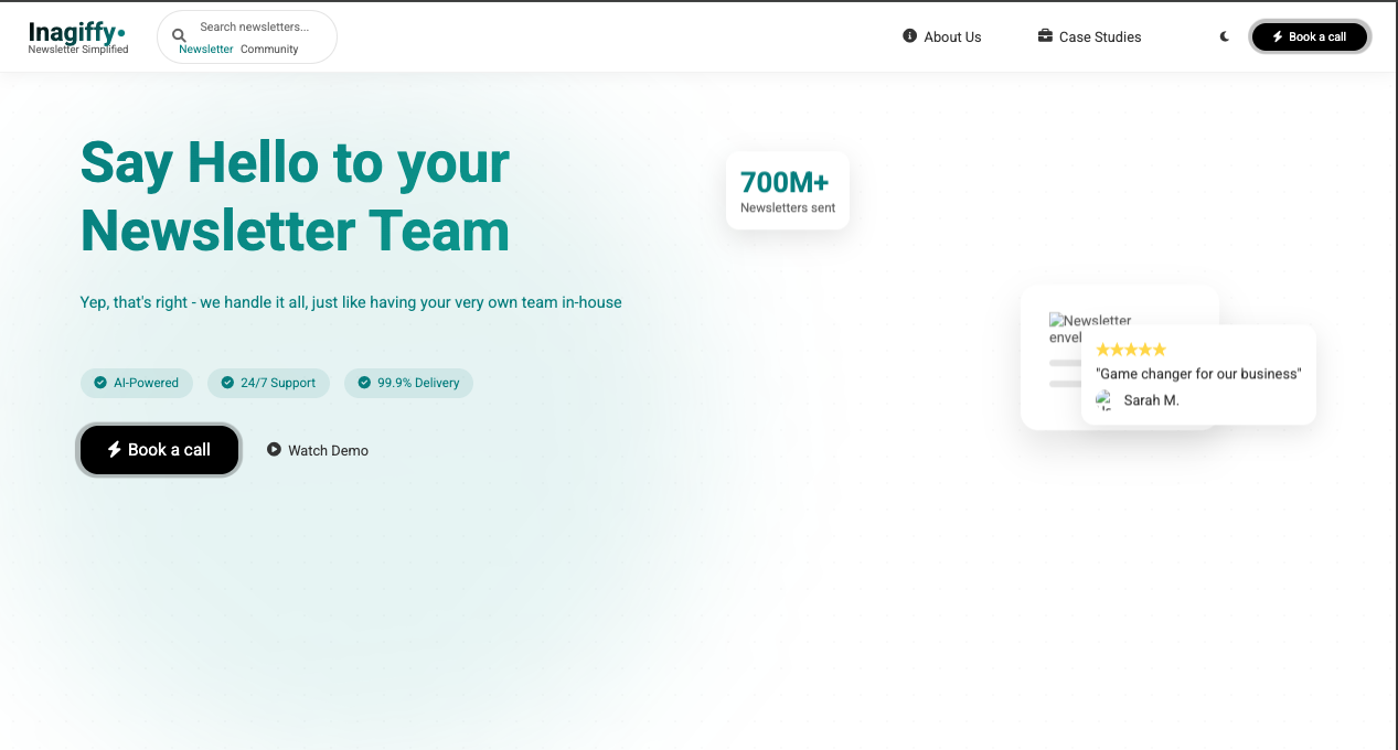
A modern, responsive landing page for a newsletter creation and management platform. Built with HTML, CSS, and vanilla JavaScript.
README
Open on GitHub ↗Inagiffy - Newsletter Management Platform
A modern, responsive landing page for a newsletter creation and management platform. Built with HTML, CSS, and vanilla JavaScript.
🚀 Features
- Responsive Design: Fully responsive across all devices
- Modern UI/UX: Clean, professional design with smooth animations
- Dark Mode: Built-in theme switcher
- Interactive Elements:
- Animated cards
- Hover effects
- Parallax scrolling
- Filter functionality
- Performance Optimized: Fast loading with minimal dependencies
- Accessibility: WCAG compliant with ARIA labels
🛠️ Technologies
- HTML5
- CSS3 (Custom properties, Flexbox, Grid)
- Vanilla JavaScript
- Font Awesome Icons
- Google Fonts
📂 Project Structure
newsletter/
├── index.html
├── styles.css
├── script.js
├── README.md
└── images/
    ├── envelope.png
    ├── tech-case.jpg
    ├── finance-case.jpg
    ├── retail-case.jpg
    ├── user-avatar.jpg
    └── partner-logos/
🎯 Key Sections
- Hero Section: Dynamic landing with floating elements
- About Section: Feature highlights with animated cards
- Case Studies: Filterable success stories
- Footer: Comprehensive footer with newsletter signup
🚀 Getting Started
- Clone the repository:
git clone https://github.com/yourusername/inagiffy.git
Open
index.htmlin your browserFor development:
- Use a local server (e.g., Live Server for VS Code)
- Make sure all image paths are correct
💻 Development
To modify the project:
Styles: Edit
styles.css- Variables are defined in
:root - Mobile styles are at the bottom
- Variables are defined in
JavaScript: Edit
script.js- All event listeners are in DOMContentLoaded
- Animations and interactions are modular
Content: Edit
index.html- Update text and images
- Maintain semantic structure
📱 Responsive Breakpoints
- Mobile: < 768px
- Tablet: 768px - 1024px
- Desktop: > 1024px
⚡ Performance Tips
- Optimize images before adding
- Minimize third-party scripts
- Use WebP format for images where possible
- Lazy load images below the fold
🎨 Customization
- Colors: Update variables in
:root - Fonts: Change Google Fonts link
- Icons: Use Font Awesome classes
- Images: Replace in
/imagesdirectory
📄 License
MIT License - feel free to use for personal or commercial projects.
🙏 Credits
Designed & Developed by Oceed Codes
🤝 Contributing
- Fork the project
- Create feature branch
- Commit changes
- Push to branch
- Open pull request
📞 Support
For support, email [email protected] or open an issue on GitHub.